The most common way to handle complexity and factor Lit code into separate units is component composition: that is, the process of building a large, complex component out of smaller, simpler components. Imagine you've been tasked with implementing a screen of UI:
You can probably identify the areas which will involve some complexity to implement. Chances are, those could be components.
By isolating the complexity into specific components, you make the job much simpler, and you can then compose these components together to create the overall design.
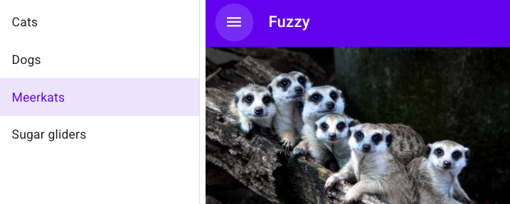
For example, the fairly simple screenshot above involves a number of possible components: a top bar, a menu button, a drawer with menu items for navigating the current section; and a main content area. Each of these could be represented by a component. A complex component, like a drawer with a navigation menu, might be broken into many smaller components: the drawer itself, a button to open and close the drawer, the menu, individual menu items.
Lit lets you compose by adding elements to your template—whether those are built-in HTML elements or custom elements.
When deciding how to break up functionality, there are several things that help identify when to make a new component. A piece of UI may be a good candidate for a component if one or more of the following applies:
It has its own state.
It has its own template.
It's used in more than one place, either in this component or in multiple components.
It focuses on doing one thing well.
It has a well-defined API.
Reusable controls like buttons, checkboxes, and input fields can make great components. But more complex UI pieces like drawers and carousels are also great candidates for componentization.
When exchanging data with subcomponents, the general rule is to follow the model of the DOM: properties down, events up.
Properties down. Setting properties on a subcomponent is usually preferable to calling methods on the subcomponent. It's easy to set properties in Lit templates and other declarative template systems.
Events up. In the web platform, firing events is the default method for elements to send information up the tree, often in response to user interactions. This lets the host component respond to the event, or transform or re-fire the event for ancestors farther up the tree.
A few implications of this model:
A component should be the source of truth for the subcomponents in its shadow DOM. Subcomponents shouldn't set properties or call methods on their host component.
If a component changes a public property on itself, it should fire an event to notify components higher in the tree. Generally these changes will be the result of user actions—like pressing a button or selecting a menu item. Think of the native input element, which fires an event when the user changes the value of the input.
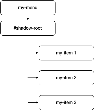
Consider a menu component that includes a set of menu items and exposes items and selectedItem properties as part of its public API. Its DOM structure might look like this:
When the user selects an item, the my-menu element should update its selectedItem property. It should also fire an event to notify any owning component that the selection has changed. The complete sequence would be something like this:
The user interacts with an item, causing an event to fire (either a standard event like click, or some event specific to the my-item component).
The my-menu element gets the event, and updates its selectedItem property. It may also change some state so that the selected item is highlighted.
The my-menu element fires a semantic event indicating that the selection has changed. This event might be called selected-item-changed, for example. Since this event is part of the API for my-menu, it should be semantically meaningful in that context.
For more information on dispatching and listening for events, see Events.
Properties down and events up is a good rule to start with. But what if you need to exchange data between two components that don't have a direct descendant relationship? For example, two components that are siblings in the shadow tree?
One solution to this problem is to use the mediator pattern. In the mediator pattern, peer components don't communicate with each other directly. Instead, interactions are mediated by a third party.
A simple way to implement the mediator pattern is by having the owning component handle events from its children, and in turn update the state of its children as necessary by passing changed data back down the tree. By adding a mediator, you can pass data across the tree using the familiar events-up, properties-down principle.
In the following example, the mediator element listens for events from the input and button elements in its shadow DOM. It controls the enabled state of the button so the user can only click Submit when there's text in the input.
Other mediator patterns include flux/Redux-style patterns where a store mediates changes and updates components via subscriptions. Having components directly subscribe to changes can help avoid needing every parent to pass along all data required by its children.
In addition to the nodes in your shadow DOM, you can render child nodes provided by the component user, like the standard <select> element can take a set of <option> elements as children and render them as menu items.
Child nodes are sometimes referred to as "light DOM" to distinguish them from the component's shadow DOM. For example:
Here the top-bar element has two light DOM children supplied by the user: a navigation button, and a title.
Interacting with light DOM children is different from interacting with nodes in the shadow DOM. Nodes in a component's shadow DOM are managed by the component, and shouldn't be accessed from outside the component. Light DOM children are managed from outside the component, but can be accessed by the component as well. The component's user can add or remove light DOM children at any time, so the component can't assume a static set of child nodes.
The component has control over whether and where the child nodes are rendered, using the <slot> element in its shadow DOM. And it can receive notifications when child nodes are added and removed by listening for the slotchange event.